

Typography:
select projects from
type 1 class and
interactive media
OBJECTIVE
To design two 2-page spreads (one type-dominant, one image-dominant) using the Whitney HTF type family and the provided images and copy on the poster design of Jacqueline Casey; to design a six-page booklet using provided images and sourced copy on designer Cipe Pineles, utilizing one serif and one sans-serif typeface option; to design a website detailing a process or history of something, with multiple pages to navigate between.
YEAR
Sophomore + Junior
\\
The two projects involving printed text were assigned in my sophomore year Type 1 class. For the Jacqueline Casey project, I designed one type-dominant and one image-dominant composition, as if they were each the first spread of a multi-page article. Each utilizes a five-column grid, a clear hierarchy of Whitney family members for distinguishing title from body copy from caption, and they are seen here in presentation format, arranged on a black backdrop.
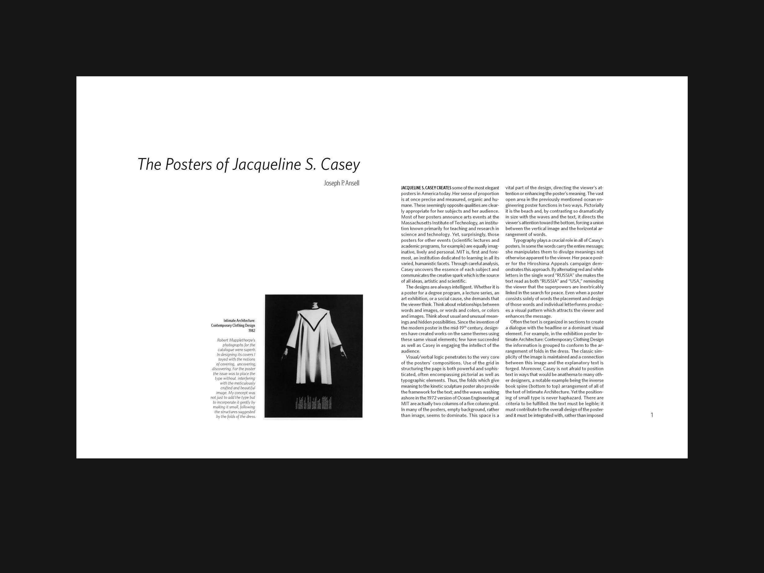
The two Casey spreads.

For the Cipe Pineles booklet, I was tasked with choosing a serif type family and a sans-serif type family and using them to format a self-sourced article on the designer, accompanied by a provided selection of Pineles’s work. I decided on Utopia Std in a heavy weight for the display, and I set the body copy in justified columns of (tried-and-true) Whitney HTF, which together recall the covers and interiors of the midcentury magazines Pineles designed. The six-page booklet contained three interior spreads, as well as a cover and colophon page, all designed using a three-column grid.

Title page

Spread 1

Spread 2

Spread 3

Colophon

For the junior year Interactive Media project, I chose an essay I had written in high school about my personal history with the patchwork blankets known as quilts, and designed a multi-section webpage prototype in Adobe XD. The page features a selection of relevant quilt photos, halftone imagery, and captions that appear with a cursor hover. The type treatment, influenced by the work of Martin Venezky, is a combination of several weights and colors each of Berthold Akzidenz Grotesk, Gotham Narrow, and Garamond Premier Pro, resulting in a patchwork feel that complements the eclectic construction of the quilts themselves.
Website walkthrough video