

Beyond the Curve EP:
7” record sleeve design
and promotional video
OBJECTIVE
To design an original special edition 7” record sleeve and insert item for a collection of existing music, and a 10-25 second video promoting the release of the record.
YEAR
Junior
\\
For this two-part project, I selected four songs off Crying’s 2016 LP Beyond the Fleeting Gales to be a 2022 remastered EP release. The title Beyond the Curve is a nod to the original album, to the title and lyrics of the last song on both the album and the EP (“The Curve”), and to the project’s fictional placement as the band’s subsequent release to Beyond the Fleeting Gales. The rock sound of the album is an interesting juxtaposition of grand, hard-hitting guitar riffs with vocals and lyrics that celebrate life’s simplicity and small victories, which led me to a photographic design direction drawing on Walter Wick’s work for the I Spy book series—making an assortment of small, childish objects into a big world of its own.
Winner of a 2023 American Package Award
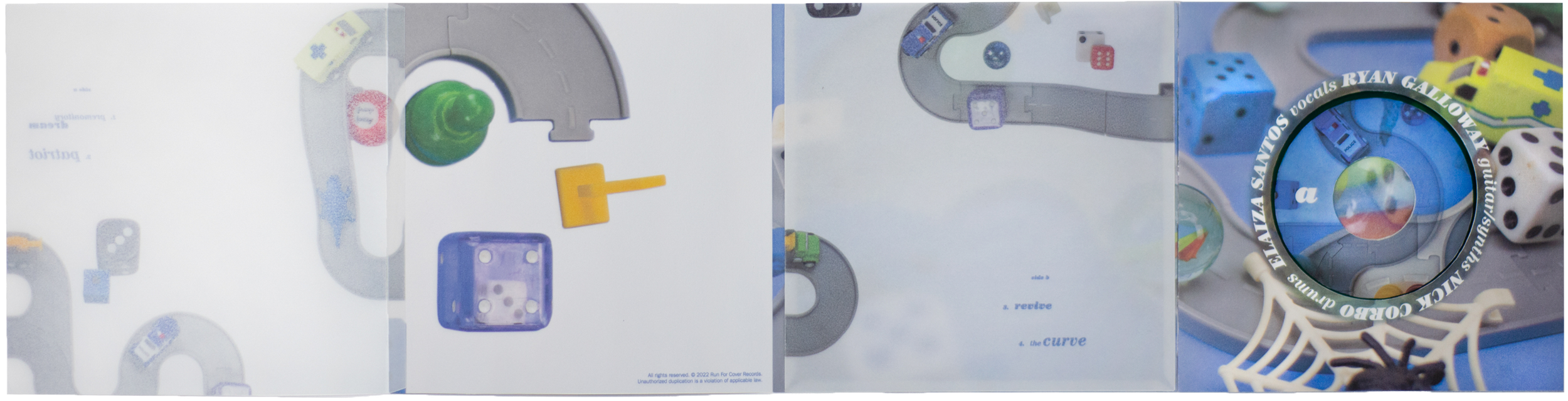
The fully unfolded album sleeve.
The first step in my process was to amass a collection of small childhood toys, marbles, and dice, and to begin experimenting in the photography studio. I found success with a careful layout of a toy road set surrounded by dice, game pieces, and other small items, arranged on top of a sheet of blue construction paper. I brought a wide variety of shots at different distances and angles into Photoshop and overlaid them, settling on a few subtle arrangements of close crops under wider aerial shots. I used the multiply blending mode, which allowed the two separate worlds created by contrasting scale to conflate in interesting ways. The image to the left is what I chose to be my final album cover.
Two-layer poster insert
Beyond the Curve release video
For the poster insert, I emulated the layered photo treatment in a physical manner by including a top vellum layer printed with the zoomed-out toy compositions, over a much larger-scale arrangement underneath, fastened with grommets. I carried this technique through to the record sleeve, using similarly printed vellum for the insert pocket and adding an extra flap. In addition, the type treatment of alternating bold and ultra weights of ITC Century Italic in a variety of sizes, originally exclusive to the poster, came to be the dominant way of handling type throughout the whole project.
My strategy for the promotional video was to use the typographic system and image handling of the physical deliverables, then to translate their unique aesthetic to the context of motion, since the band did not already have an established public identity or presence with which to promote the release. I chose a clip from the chorus of the track “Revive” and synced the lyrics to appear word by word as they are sung in the song, assembling in textured arrangements that recall the poster and the sleeve’s track listing. There is a mix of sudden, staccato introduction and vanishment as well as fluid motion of the elements of the video, whether it be groups of lyrics or the images layered in the same manner as the still photography for the album.
When in the final stages of constructing the physical album, I stumbled upon a richly colored 45 record in an antiques store, allowing the collection to be released on “limited edition transparent green vinyl.” The complete shoot of the full special release captures the front, back, and all stages of unfolding the record sleeve and poster.


