

Southern Mag:
proposed logo and
branding system
OBJECTIVE
To discover and communicate the brand voice behind Southern Mag Consulting Arborist, delivering a distinctive logo and functional typographic lockup in line with the client’s visual preferences.
YEAR
Senior
\\
In January 2023, I was hired to perform brand consulting and create a visual identity system for Southern Mag, an Auburn, Alabama-based company providing tree consulting services. Over the next couple of months, I met with the client to establish the objectives of the brand and identify some visual reference from competition and businesses with similar clienteles. Using our talking points, I conducted independent visual research and ideation and formulated a logo solution, accompanied by a few options for a typographic direction. Due to shifting company needs, Southern Mag was never finalized and used, but below is featured the extent of my research and process work, including the phase-one presentation I delivered to the client.
Based on some quick type sketches as a part of my design iteration process, I undertook an interesting personal type design project in the midst of my type studies. I established a few key ratios, measurements, and angles, and then worked out digitally how each letter might fit into the feel of the typeface based on that framework, with the goal of giving Southern Mag the possibility of custom lettering.


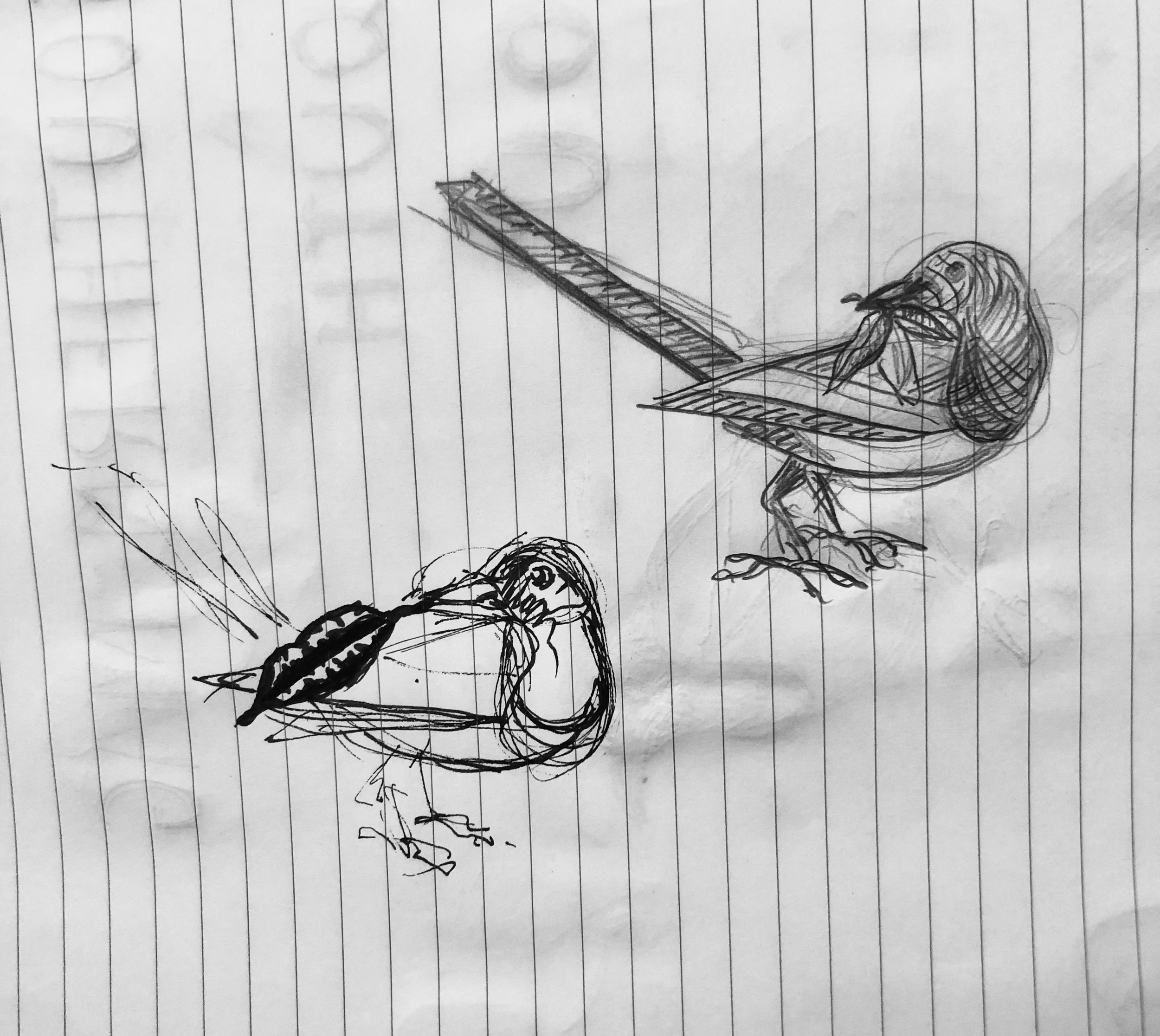

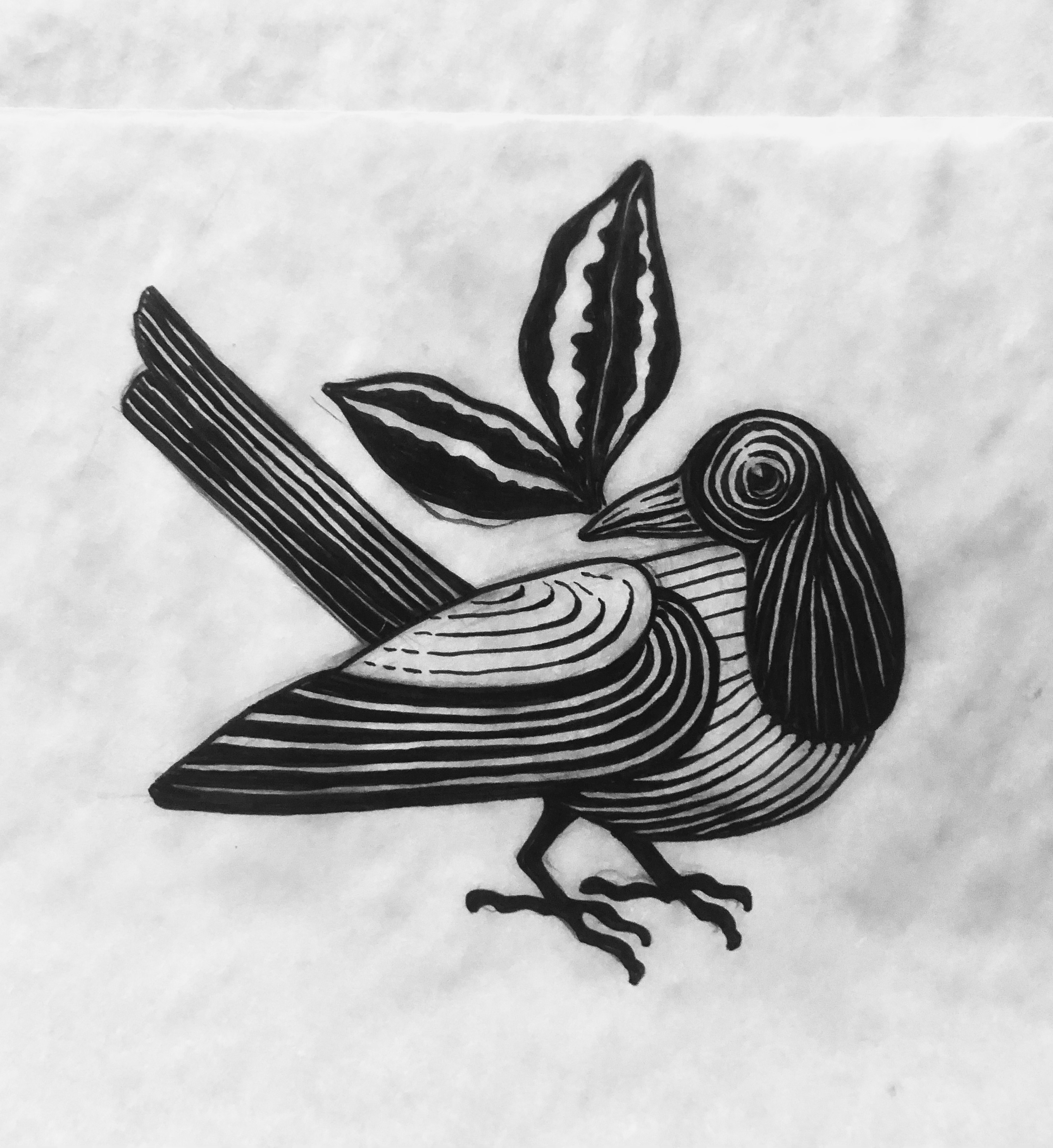
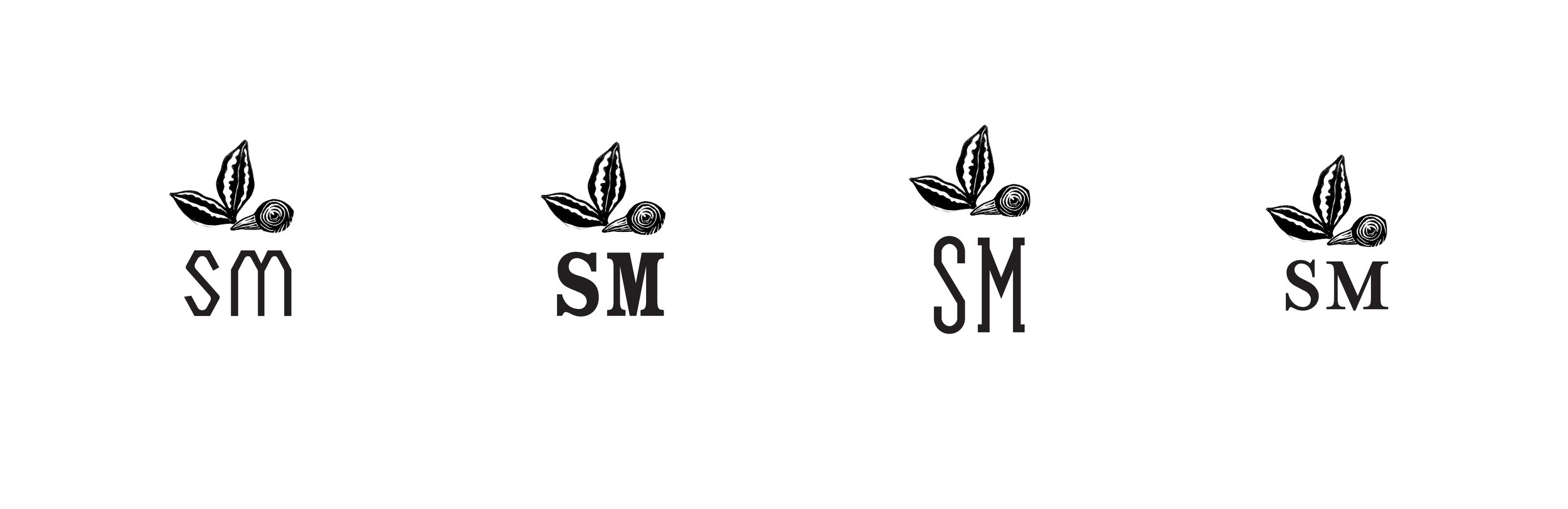
My next focus was on fleshing out a logo for Southern Mag. On the surface, the brand name represented the colloquial term for the Southern magnolia tree, but deeper down, “Mag” was an homage to the client’s historical family ties to the symbol of the magpie. I focused on a magpie interpretation for the logo as per the client’s wishes, throwing in some magnolia leaves to tie the whole mark together with the brand name for the average viewer. I ended with a proposed bird symbol and four unfinished options for a type direction, as well as some comps for a monogram based on the client’s expressed needs for a smaller, more concise logo option to accompany the main lockup.
For our second in-person meeting, I compiled a presentation and initial case study of all of the information we had discussed, the brand references they gave me as well as my own visual research, and my design exploration process. Despite the dropping of the project, I am grateful for the independent freelance experience and the visual discoveries I made along the way, and I am excited to pursue the type design study and one-color artstyle of the magpie as personal projects.


